Once you have decided on illuminated lettering, the next question is how it should be lit. The two main options produce genuinely different results, and the right answer depends almost entirely on where your customers are looking from.
Front-lit (standard channel letters)
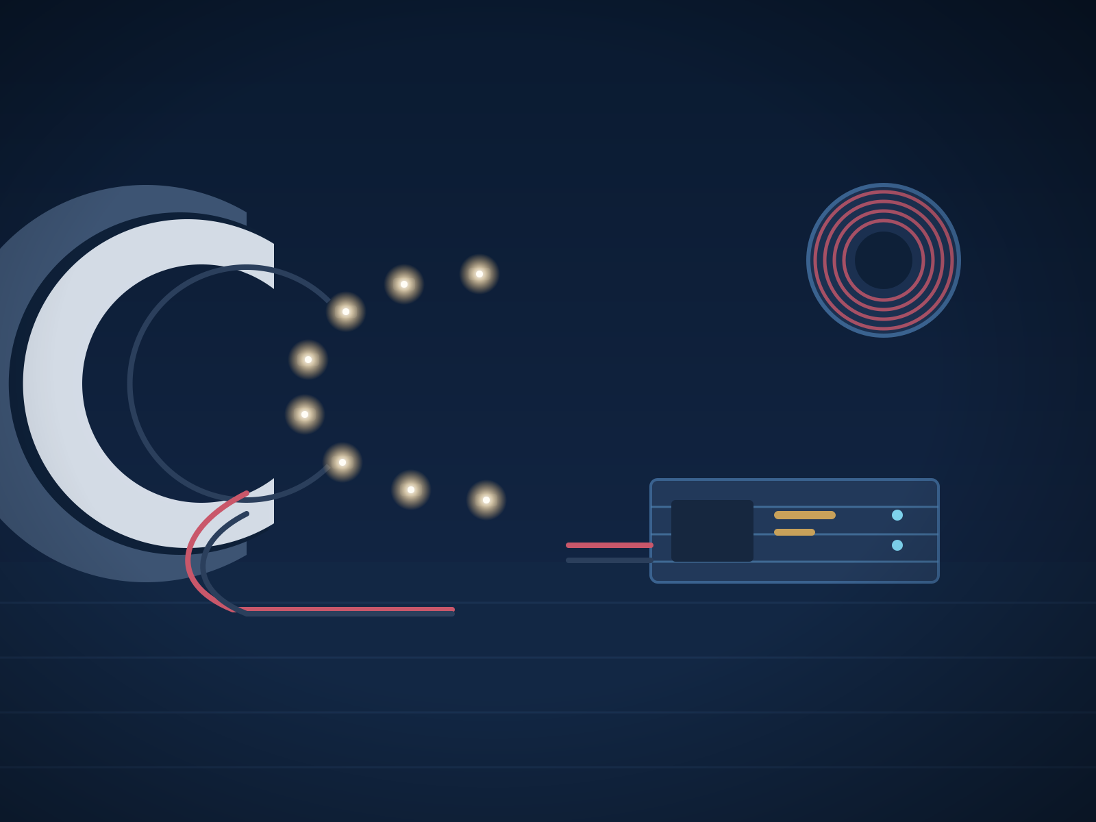
Light passes through a translucent acrylic face and out toward the viewer. The letterform itself glows.
Strengths: maximum legibility and visibility, especially at distance and in poor weather. Works with virtually any brand colour. The most cost-effective illuminated construction.
Best for: retail, food service, automotive, anything read from a moving vehicle, and any site where a competitor's sign is nearby.
Halo-lit (reverse channel letters)
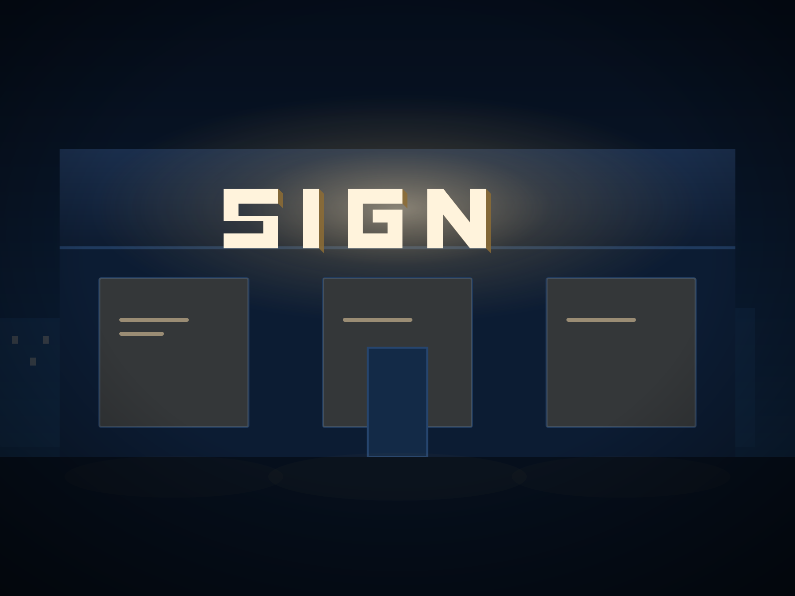
The face is opaque. Light escapes from the back of the letter onto the wall behind, producing a soft outline around a solid letterform.
Strengths: a distinctly premium, restrained appearance. Shows off metal finishes — brushed stainless and blackened steel look exceptional halo-lit. Considerably less visually aggressive at night.
Best for: professional services, hospitality, corporate reception, boutique retail, and any frontage read at walking pace.
Limitations: markedly less legible at distance, and the effect depends on the wall behind it. A dark wall absorbs the halo and largely defeats the point.
Combination lighting
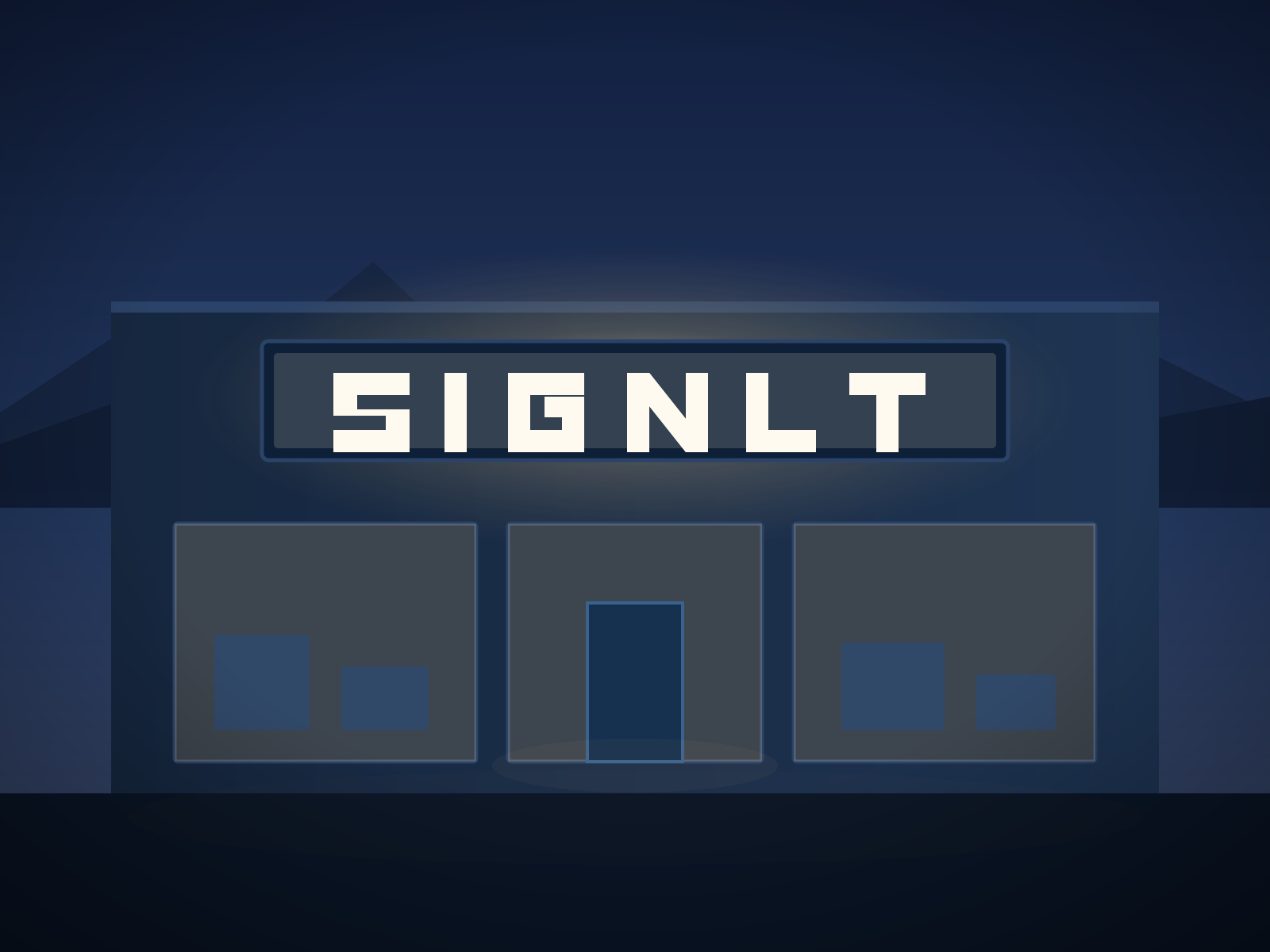
Translucent face plus halo. Highly visible and visually rich, at roughly a 30 to 40 percent premium over front-lit. Worth it where a sign is a genuine focal point — hotel entrances, flagship stores, landmark buildings.
The decision, simplified
Ask two questions:
- How far away is the furthest customer who needs to read this? Beyond about 30 metres, front-lit.
- Are they moving? If they are driving past, front-lit. If they are on foot, halo becomes viable.
Then check the wall. Halo-lighting only works against a surface light enough to reflect the glow — pale render, light brick and painted concrete all work well. Dark brick, black cladding and heavily textured surfaces do not.
Colour temperature
Often overlooked and it makes a substantial difference:
- 6500K (cool white): crisp and bright. Suits medical, automotive and technology.
- 4000K (neutral): a safe middle ground for general retail.
- 3000K (warm white): noticeably softer. Suits hospitality, food service and anywhere with a timber or brick interior visible through glazing.
Matching the sign's colour temperature to the interior lighting visible behind it is a small detail that makes a frontage feel considered rather than assembled.
A note on brightness
Brighter is not automatically better. Over-bright signage looks cheap, can breach local bylaws on light trespass, and irritates residential neighbours — which is how sign complaints start. We size output to the viewing distance rather than defaulting to maximum, and dimmable drivers with astronomical timers are inexpensive additions worth specifying.