Channel letters are the most requested exterior sign we make, and also the one clients most often assume they cannot afford. The upfront cost is genuinely higher than a single illuminated cabinet. What that money buys is worth understanding properly before you decide either way.
Individual letters read better than a box
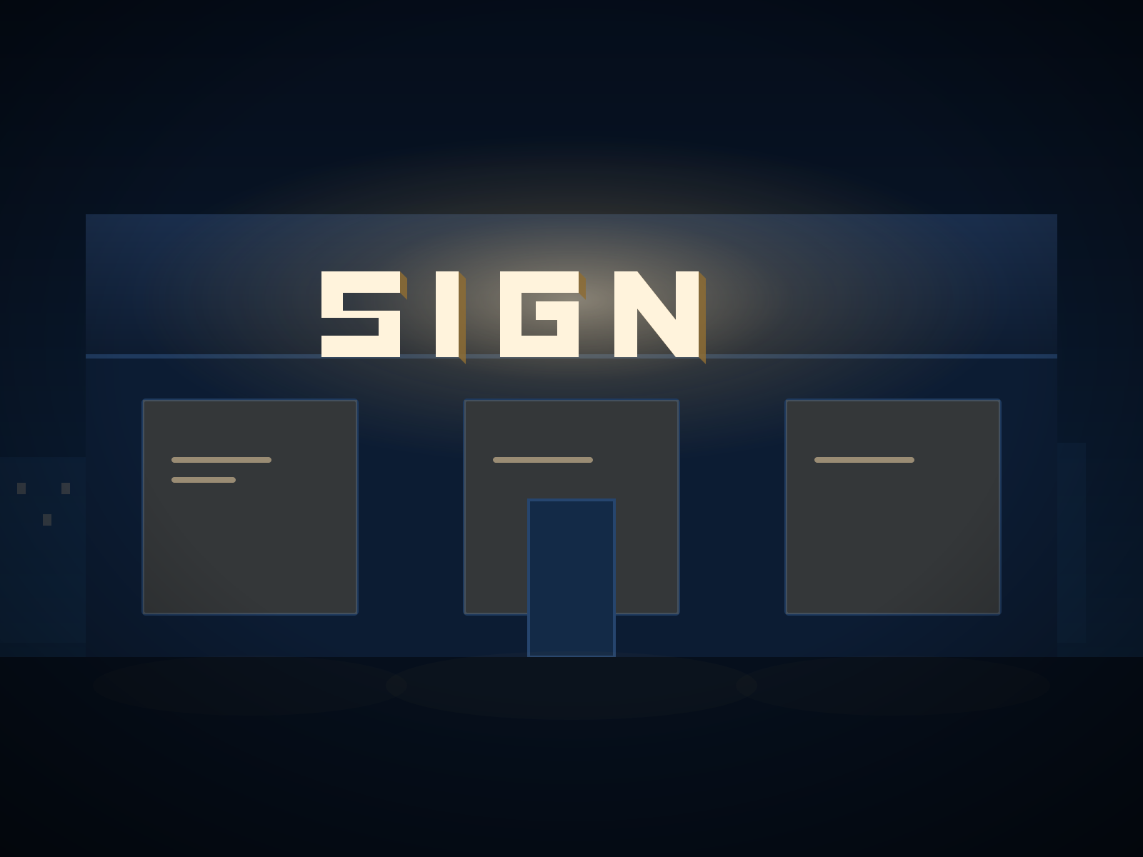
A light box is one rectangle with your name printed on it. Channel letters are individual fabricated shapes mounted directly to the building. The difference at street level is significant: the letters relate to the architecture rather than sitting on top of it, and the eye reads the word rather than the rectangle containing it.
This matters most on wide fascias. A box that spans 20 feet looks like a box. Twenty feet of individual letters looks like the building was designed with the sign in mind.
Night-time legibility is not the same as brightness
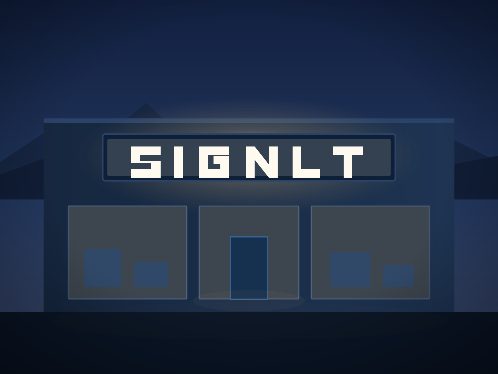
Front-lit channel letters push light through a translucent face, and because each letter is illuminated separately there is no bright background competing with the letterforms. A backlit box, by contrast, often produces a glowing rectangle in which the copy reads as a dark shape.
The practical consequence is that channel letters stay legible at distances where a box has become a bright smudge. If your customers arrive by car on an arterial road, this is the single strongest argument for the format.
What they cost to run
Modern LED channel letters draw very little. A typical storefront set runs at a small fraction of the load of the fluorescent signage it usually replaces, and modules rated for 50,000+ hours mean roughly eleven years of dusk-to-dawn operation before output drops meaningfully.
Drivers are the component most likely to need attention, usually somewhere between years five and eight. On a well-built set they are accessible, and replacing one is a short service call rather than a rebuild.
Where the durability actually comes from
Not all channel letters are equal, and the differences are mostly invisible on install day:
- Welded returns versus taped. A welded seam does not open up after four winters of thermal cycling.
- Sealed electrical entries. Every point where a wire passes through the can is a potential water path. Gasketed and sealed entries are the difference between a sign that lasts and one that fails from the inside.
- Marine-grade fasteners. On the coast, ordinary plated hardware will stain the facade within two years.
- Trim cap quality. The retainer holding the face on is what fails first on cheap letters — usually as a face that pops out in a windstorm.
When channel letters are the wrong choice
They are not always right. If your fascia is narrow and your name is long, individual letters may end up too small to read and a well-designed cabinet will serve you better. If your landlord criteria prohibit internal illumination, dimensional letters with downlighting are the stronger option. And if you are in a short-term lease with no certainty of renewal, the economics rarely justify the investment.
We will tell you when that is the case. A sign that is wrong for the site is a bad outcome regardless of how well it is built.
Front-lit or halo-lit?
Front-lit is brighter and more legible at distance — the right answer for retail, food service and anything read from a moving vehicle. Halo-lit is softer and reads as more premium, which suits professional services, hospitality and walk-up frontages. Combination letters do both and cost accordingly.
If you are unsure, the test is simple: how far away is the furthest customer who needs to read this, and how fast are they moving?